

Refer and earn for every successful referral. Also, the most active user wins ₦5,000 in cash!
, Check Verification Solution Hub Groups Pages Market Events Blogs Funding Offers Jobs Courses Movies Games Merits
 Terms and Conditions
 Legal & Business Law Agreement
 Child Safety & Policy
 App Installation Guide
 User Guide Page
 Investors & Partnership agreement
 About Us
 Flowisetech Earning Guide
 Terms of Use
 Privacy Policy
 Help
Help
 FAQs
FAQs
 Community Guidelines
 Our Purpose
 Withdrawal Terms
 Verification Terms
 Community Policy
Advanced Product Card Using HTML, CSS, and JavaScript
Here’s an advanced product card using HTML, CSS, and JavaScript, featuring:
✔ Hover effects
✔ Add to cart button
✔ Quick view modal
✔ Rating system
✔ Dark mode support
✔ Animated interactions
Features Included:
- Hover Effects: Smooth scaling and shadowing on hover.
- Quick View Modal: Displays a larger view of the product with more details.
- Add to Cart: Adds the product to the cart.
- Rating System: Interactive star rating.
- Dark Mode: Toggle between light and dark themes.
Full Source Code:
1. HTML (index.html)
<!DOCTYPE html>
<html lang="en">
<head>
<meta charset="UTF-8">
<meta name="viewport" content="width=device-width, initial-scale=1.0">
<title>Advanced Product Card</title>
<link rel="stylesheet" href="styles.css">
<script defer src="script.js"></script>
</head>
<body>
<div class="theme-toggle">
<button id="darkModeToggle">Toggle Dark Mode</button>
</div>
<div class="product-card">
<div class="product-image">
<img src="product.jpg" alt="Product Image">
<button class="quick-view">Quick View</button>
</div>
<div class="product-info">
<h2 class="product-title">Product Name</h2>
<p class="product-price">$49.99</p>
<div class="rating">
★★★★★
</div>
<button class="add-to-cart">Add to Cart</button>
</div>
</div>
<div class="modal" id="modal">
<div class="modal-content">
<span class="close-modal">×</span>
<h2>Product Name</h2>
<img src="product.jpg" alt="Product Image">
<p>Detailed description of the product.</p>
<button class="add-to-cart">Add to Cart</button>
</div>
</div>
</body>
</html>
2. CSS (styles.css)
/* General Styles */
body {
    font-family: Arial, sans-serif;
    background-color: #f5f5f5;
    text-align: center;
    transition: background 0.3s ease;
}

/* Dark Mode */
body.dark-mode {
    background-color: #222;
    color: white;
}

/* Theme Toggle */
.theme-toggle {
    margin: 20px;
}

#darkModeToggle {
    padding: 10px;
    cursor: pointer;
}

/* Product Card */
.product-card {
    width: 250px;
    background: white;
    padding: 20px;
    border-radius: 10px;
    box-shadow: 0 4px 10px rgba(0, 0, 0, 0.1);
    margin: auto;
    transition: transform 0.3s ease;
}

.product-card:hover {
    transform: scale(1.05);
}

.product-image {
    position: relative;
}

.product-image img {
    width: 100%;
    border-radius: 10px;
}

.quick-view {
    position: absolute;
    bottom: 10px;
    left: 50%;
    transform: translateX(-50%);
    padding: 5px 10px;
    background: #ff6600;
    color: white;
    border: none;
    cursor: pointer;
    display: none;
}

.product-image:hover .quick-view {
    display: block;
}

.product-title {
    font-size: 18px;
    margin: 10px 0;
}

.product-price {
    font-size: 20px;
    color: #ff6600;
}

.rating {
    color: gold;
    font-size: 20px;
}

.add-to-cart {
    background: #007bff;
    color: white;
    padding: 10px;
    border: none;
    cursor: pointer;
    margin-top: 10px;
}

.add-to-cart:hover {
    background: #0056b3;
}

/* Modal */
.modal {
    display: none;
    position: fixed;
    top: 0;
    left: 0;
    width: 100%;
    height: 100%;
    background: rgba(0, 0, 0, 0.7);
    justify-content: center;
    align-items: center;
}

.modal-content {
    background: white;
    padding: 20px;
    border-radius: 10px;
    text-align: center;
}

.close-modal {
    float: right;
    font-size: 24px;
    cursor: pointer;
}

.dark-mode .modal-content {
    background: #333;
    color: white;
}
3. JavaScript (script.js)
document.addEventListener("DOMContentLoaded", function () {
    // Dark Mode Toggle
    const darkModeToggle = document.getElementById("darkModeToggle");
    darkModeToggle.addEventListener("click", function () {
        document.body.classList.toggle("dark-mode");
    });

    // Quick View Modal
    const modal = document.getElementById("modal");
    const quickViewBtn = document.querySelector(".quick-view");
    const closeModal = document.querySelector(".close-modal");

    quickViewBtn.addEventListener("click", function () {
        modal.style.display = "flex";
    });

    closeModal.addEventListener("click", function () {
        modal.style.display = "none";
    });

    window.addEventListener("click", function (e) {
        if (e.target === modal) {
            modal.style.display = "none";
        }
    });
});
How to Use:
- Save the above files as index.html, styles.css, and script.js.
- Replace
"product.jpg"with your actual product image. - Open index.html in a browser to test.
Enhancements:
- ✅ Add animations (e.g., fade-in effect on hover).
- ✅ Integrate with a shopping cart system.
- ✅ Use localStorage to remember dark mode settings.
- ✅ Implement a real-time rating system.
Would you like to enhance it further with AJAX-based cart updates or API integration?
Categories
- Make Money
- Product Review
- Social Media
- Excel
- Graphics design
- Freelancing/Consulting
- E-commerce and Digital Marketing
- Business
- Self Development
- Tips to Success
- Video Editing
- Photo Editing
- Website Promotion
- YouTube
- Computer
- Phone
- Music
- Spirituality & Faith
- School
- Tech & Digital
- Gaming
- News
- Digital Economy / Technology
- Relationship
- Creative Arts & Design
- Medical
- Causes
- Networking
Read More
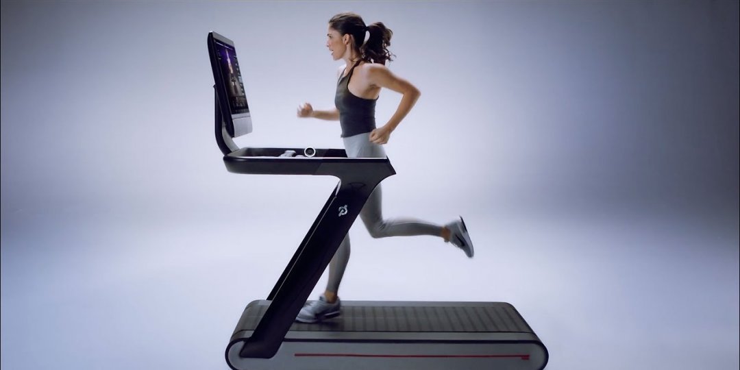
In today’s tech-savvy world, staying fit is no longer just about hitting the gym or going for a run—it’s about integrating smart tools into your lifestyle that actively motivate you to move every day. With the rise of wearable technology and smart home fitness gear, the fitness journey has transformed into a more personalized and engaging experience. Whether you're a...
Here’s a concise guide on Creating and Analyzing Malware, focusing on Sandboxing and Reverse Engineering Basics, along with key points: Creating and Analyzing Malware (For educational and ethical cybersecurity research only) 🔐 Disclaimer Malware creation and analysis should only be conducted in controlled, legal environments (e.g., for cybersecurity education, research, or...

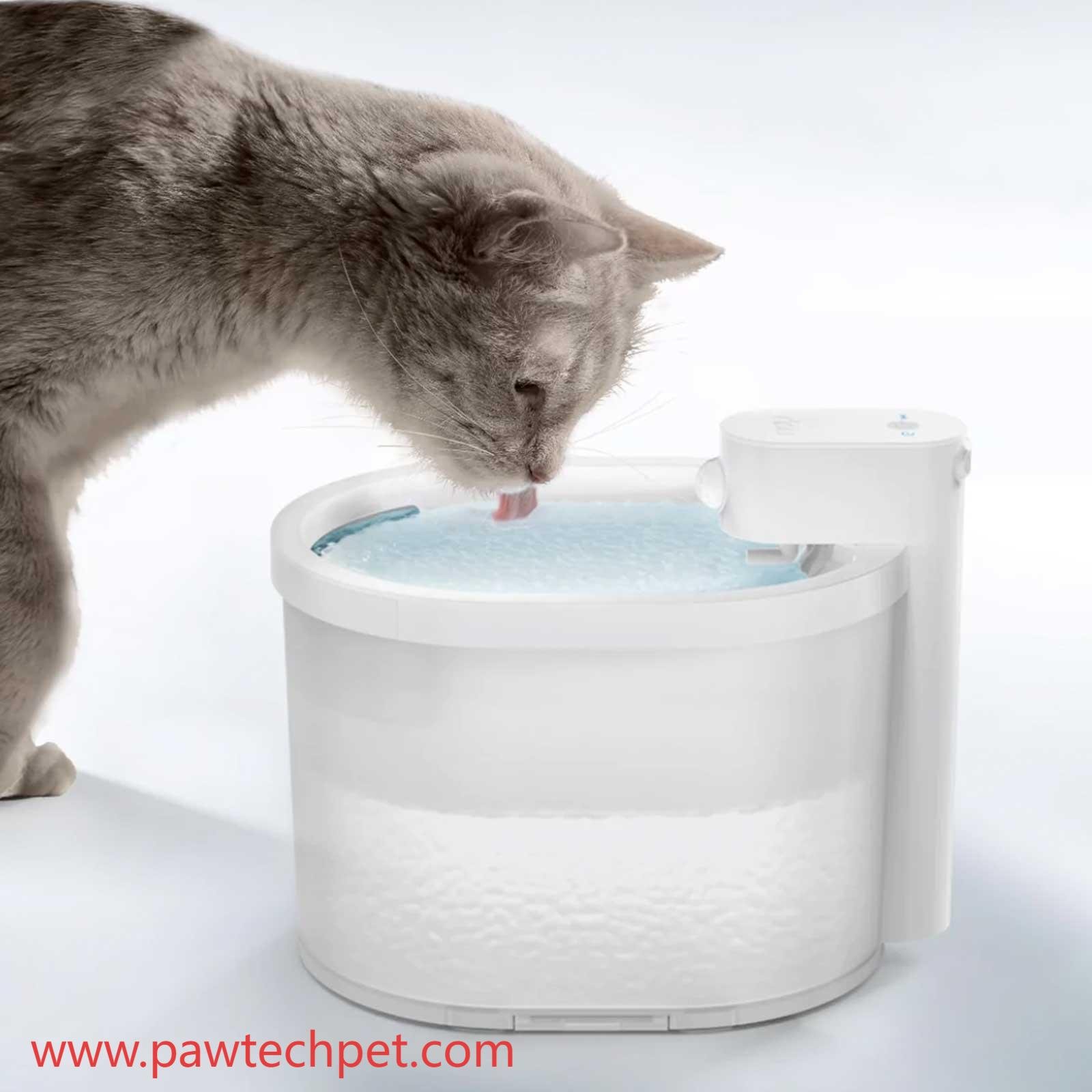
In a world that values both comfort and connection, pet care is no longer just a task—it's a lifestyle. For owners who prioritize their furry companion's daily needs, the Intelligent Pet Water Dispenser by Pawtechpet offers a calm, consistent way to support wellness without constant supervision. Water isn't just essential—it's foundational to energy, digestion, and long-term...
Your mindset is one of the most powerful forces shaping your life. It determines how you think, how you act, and ultimately, the results you get. The difference between staying stuck and moving forward often comes down to one thing: how you see the world and your place in it. This isn’t about how much money you currently have. It’s about the habits, beliefs, and daily decisions...

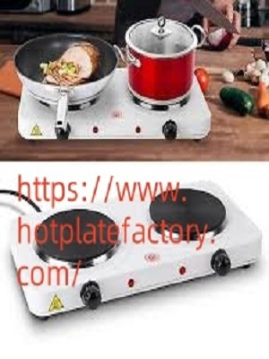
In many modern compact kitchens and mobile cooking setups, a Hot Plate in the center of the counter often plays a critical role in delivering versatile heat without taking up much space. With changing lifestyles and shrinking urban living spaces, portable cooking appliances have become more essential than ever. Compact heating equipment is particularly valued by students, mobile food vendors,...