

Refer and earn for every successful referral. Also, the most active user wins ₦5,000 in cash!
, Check Verification Solution Hub Groups Pages Market Events Blogs Funding Offers Jobs Courses Movies Games Merits
 Terms and Conditions
 Legal & Business Law Agreement
 Child Safety & Policy
 App Installation Guide
 User Guide Page
 Investors & Partnership agreement
 About Us
 Flowisetech Earning Guide
 Terms of Use
 Privacy Policy
 Help
Help
 FAQs
FAQs
 Community Guidelines
 Our Purpose
 Withdrawal Terms
 Verification Terms
 Community Policy
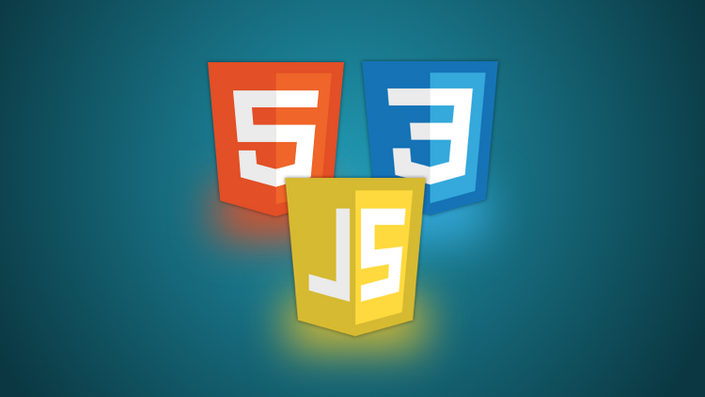
CSS Grid and Flexbox

CSS Grid and Flexbox are two powerful layout systems in CSS, each designed to handle different kinds of layout needs. Here's a brief overview of each:
CSS Grid
CSS Grid is a two-dimensional layout system, meaning it can handle both rows and columns. It's ideal for more complex, grid-based layouts.
Key Features:
- Two-Dimensional Layout: CSS Grid works on both axes (horizontal and vertical), making it perfect for creating complex layouts where items are aligned in both rows and columns.
- Explicit Grid: You can define the grid structure explicitly using
grid-template-rows,grid-template-columns, andgrid-template-areas. - Placement Control: Items can be placed precisely using grid line numbers or named areas, offering fine control over where items are placed.
- Gaps: The
grid-gapproperty (orgapin newer CSS) allows for easy spacing between grid items. - Responsive Design: CSS Grid can easily adapt to responsive design, with different grid layouts for different screen sizes.
Example:
.container {
  display: grid;
  grid-template-columns: repeat(3, 1fr);
  grid-template-rows: auto;
  gap: 10px;
}

.item1 {
  grid-column: 1 / 3;
  grid-row: 1;
}
Flexbox
Flexbox (Flexible Box Layout) is a one-dimensional layout system, perfect for layouts in a single direction (either a row or a column).
Key Features:
- One-Dimensional Layout: Flexbox is designed for laying out items in a single direction, either horizontally or vertically.
- Flex Containers and Items: A flex container's children become flex items that can be aligned, spaced, and ordered.
- Alignment and Justification: Flexbox provides powerful alignment options such as
justify-content,align-items, andalign-content. - Flexible Sizing: Flex items can grow, shrink, or stay fixed based on the available space, using properties like
flex-grow,flex-shrink, andflex-basis. - Order Property: You can change the visual order of items without altering the HTML using the
orderproperty.
Example:
.container {
  display: flex;
  justify-content: space-between;
  align-items: center;
}

.item1 {
  flex-grow: 2;
}

.item2 {
  flex-grow: 1;
}
When to Use CSS Grid vs. Flexbox
- Use CSS Grid: When you need a complex layout with both rows and columns, such as a grid of cards, a dashboard, or a multi-column web page.
- Use Flexbox: When you need a simpler layout in a single direction, such as a navigation bar, a set of buttons, or aligning items in a single row or column.
Both systems can be used together for different parts of a web page to create complex and responsive layouts.
Categories
- Make Money
- Product Review
- Social Media
- Excel
- Graphics design
- Freelancing/Consulting
- E-commerce and Digital Marketing
- Business
- Self Development
- Tips to Success
- Video Editing
- Photo Editing
- Website Promotion
- YouTube
- Computer
- Phone
- Music
- Spirituality & Faith
- School
- Tech & Digital
- Gaming
- News
- Digital Economy / Technology
- Relationship
- Real Estate
- Creative Arts & Design
- Medical
- Causes
- Networking
Read More
The digital economy has created unprecedented opportunities for young Africans to earn income online without needing large capital or advanced technical skills. One of the most accessible and scalable ways to achieve this is through affiliate marketing—a model that allows you to earn commissions by promoting products or services. With the rise of internet penetration, mobile usage, and...

Your 20s are often described as the best years of your life. Freedom. Energy. Endless possibilities. But what no one really tells you is that this decade can also be confusing, lonely, and emotionally exhausting. Growth in your 20s is rarely glamorous—it’s mostly quiet, uncomfortable, and uncertain. Here’s the truth people don’t talk about. 1. You’ll Feel Lost...

Integrating an Electric Garden Loader into your landscaping operations can significantly reduce manual labor while increasing precision and eco-efficiency across a wide range of outdoor applications. As green technology gains momentum, industries once heavily reliant on fuel-based machinery are transitioning to electric-powered solutions. In the gardening and small-scale construction sectors,...
Data science is used in a variety of real-world applications across industries. Here are some key areas where it's making an impact: 1. Healthcare & Medicine Disease Prediction & Diagnosis – AI models help detect diseases like cancer early using medical imaging. Drug Discovery – Data science accelerates drug discovery and development. Personalized Treatment –...

Creating a responsive navigation bar (navbar) using HTML, CSS, and JavaScript ensures that your website's menu adjusts seamlessly across different screen sizes, from desktops to mobile devices. Below is a step-by-step guide to building a responsive navbar, including key points, explanations, and full source code. Key Points of a Responsive Navbar Structure with HTML: Use the <nav>...