


Refer and earn for every successful referral. Also, the most active user wins ₦5,000 in cash!
, Check Verification Solution Hub Groupes Pages Marketplace Evènements Blogs Financement Offres Emplois Courses Film Jeux Merits
 Terms and Conditions
 Legal & Business Law Agreement
 Child Safety & Policy
 App Installation Guide
 User Guide Page
 Investors & Partnership agreement
 About Us
 Flowisetech Earning Guide
 Terms of Use
 Politique de confidentialité
 Help
Help
 FAQs
FAQs
 Community Guidelines
 Our Purpose
 Withdrawal Terms
 Verification Terms
 Community Policy
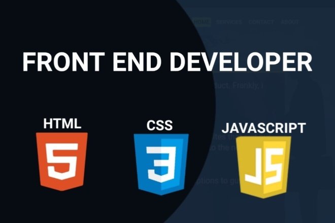
CSS Grid and Flexbox

CSS Grid and Flexbox are two powerful layout systems in CSS, each designed to handle different kinds of layout needs. Here's a brief overview of each:
CSS Grid
CSS Grid is a two-dimensional layout system, meaning it can handle both rows and columns. It's ideal for more complex, grid-based layouts.
Key Features:
- Two-Dimensional Layout: CSS Grid works on both axes (horizontal and vertical), making it perfect for creating complex layouts where items are aligned in both rows and columns.
- Explicit Grid: You can define the grid structure explicitly using
grid-template-rows,grid-template-columns, andgrid-template-areas. - Placement Control: Items can be placed precisely using grid line numbers or named areas, offering fine control over where items are placed.
- Gaps: The
grid-gapproperty (orgapin newer CSS) allows for easy spacing between grid items. - Responsive Design: CSS Grid can easily adapt to responsive design, with different grid layouts for different screen sizes.
Example:
.container {
  display: grid;
  grid-template-columns: repeat(3, 1fr);
  grid-template-rows: auto;
  gap: 10px;
}

.item1 {
  grid-column: 1 / 3;
  grid-row: 1;
}
Flexbox
Flexbox (Flexible Box Layout) is a one-dimensional layout system, perfect for layouts in a single direction (either a row or a column).
Key Features:
- One-Dimensional Layout: Flexbox is designed for laying out items in a single direction, either horizontally or vertically.
- Flex Containers and Items: A flex container's children become flex items that can be aligned, spaced, and ordered.
- Alignment and Justification: Flexbox provides powerful alignment options such as
justify-content,align-items, andalign-content. - Flexible Sizing: Flex items can grow, shrink, or stay fixed based on the available space, using properties like
flex-grow,flex-shrink, andflex-basis. - Order Property: You can change the visual order of items without altering the HTML using the
orderproperty.
Example:
.container {
  display: flex;
  justify-content: space-between;
  align-items: center;
}

.item1 {
  flex-grow: 2;
}

.item2 {
  flex-grow: 1;
}
When to Use CSS Grid vs. Flexbox
- Use CSS Grid: When you need a complex layout with both rows and columns, such as a grid of cards, a dashboard, or a multi-column web page.
- Use Flexbox: When you need a simpler layout in a single direction, such as a navigation bar, a set of buttons, or aligning items in a single row or column.
Both systems can be used together for different parts of a web page to create complex and responsive layouts.
Catégories
- Make Money
- Product Review
- Social Media
- Excel
- Graphics design
- Freelancing/Consulting
- E-commerce and Digital Marketing
- Business
- Self Development
- Tips to Success
- Video Editing
- Photo Editing
- Website Promotion
- YouTube
- Computer
- Téléphone
- Music
- Spirituality & Faith
- École
- Tech & Digital
- Gaming
- News
- Digital Economy / Technology
- Relation
- Creative Arts & Design
- Medical
- Causes
- Networking
Lire la suite
Finding fulfillment in your career is not just about earning a paycheck—it’s about aligning your passion with your profession. Too many people spend their lives in jobs that drain their energy, rather than fuel their creativity and purpose. The good news? It’s absolutely possible to build a career around what you love. With the right mindset, strategy, and persistence, you can...

This guide will show you how to build a responsive navbar using HTML, CSS, and JavaScript with the following features: ✅ Sticky Navbar – Navbar remains fixed at the top when scrolling.✅ Submenus – Dropdown menus for better navigation.✅ Animations – Smooth transitions for an elegant look.✅ Dark Mode Toggle – Switch between light and dark themes.✅ Mobile-Friendly...
Python is a high-level, interpreted programming language known for its simplicity and readability. It is widely used in web development, data science, artificial intelligence, automation, and more. Why Learn Python? Easy to Learn: Simple syntax similar to English. Versatile: Used for web development, automation, AI, data science, etc. Large Community: Many resources and support available....

Java is a widely-used, object-oriented, high-level programming language that was developed by James Gosling and his team at Sun Microsystems in 1995. It is designed to be platform-independent, meaning that Java programs can run on any device that has a Java Virtual Machine (JVM). Key Features of Java Object-OrientedJava is based on object-oriented programming principles such as...

For most students, balancing academics with financial needs is a real challenge. The good news is that in today’s digital world, there are countless ways to make money online without affecting your studies. The key is choosing flexible income streams that allow you to earn at your own pace while keeping academics a priority. Let’s dive into practical and proven online opportunities...