



















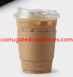

Coffee packaging is often judged through small, familiar interactions: the feel of a cup in the hand, the ease of carrying it, and the impression created by its exterior. A sleeve made from natural-looking paper can add both function and character to this experience. For businesses considering Kraft Coffee Sleeves, the important question is how paper composition, construction, comfort, and visual identity can work together. A well-considered sleeve should support everyday beverage service while reflecting the atmosphere and values a coffee business wants customers to recognize.
Kraft paper is valued for its natural appearance and distinctive fiber texture. Its warm brown tone can create an understated look without relying on elaborate decoration, while its paper-based structure offers opportunities for shaping and printing. Depending on the product design, kraft material may be used as a smooth paperboard sleeve or combined with a corrugated structure. Corrugated paper introduces a fluted layer that creates small air spaces, helping reduce direct heat transfer from the cup to the hand. The outer surface can remain suitable for printed graphics, making it possible to combine practical construction with a clear brand presentation. Buyers should consider the complete material structure rather than focusing only on the kraft color. (Sabert)
Selecting a suitable sleeve begins with understanding the beverage service environment. A neighborhood café may prefer a natural appearance that complements its interior and menu, while a takeaway chain may prioritize consistent handling across different locations. A specialty coffee business might seek a tactile finish that supports a more crafted presentation. Buyers should evaluate how the sleeve fits the actual cup, how easily staff can apply it, and whether it remains comfortable during ordinary use. The cup's shape and surface influence the sleeve's fit, so examining a sample with the intended container is more informative than choosing by appearance alone. It also allows businesses to consider storage, packaging workflow, and customer handling before placing an order.
The functional design of a kraft sleeve depends on its ability to maintain its form around the cup. A sleeve should sit securely without becoming difficult to apply or remove. Its structure should provide a useful gripping surface, and the edges should feel appropriate when the customer holds the beverage. Corrugated construction can offer a textured surface and an insulating air space, while embossed paperboard creates raised patterns that change the way the sleeve feels against the hand. Cutting, creasing, folding, and joining processes contribute to the final shape. When these operations are coordinated, the sleeve can combine a practical fit with a neat, consistent appearance. (YBJ Packing)
Manufacturing quality influences how consistently a sleeve performs across a production batch. Paper selection needs to match the chosen forming method, and the converting process should produce clean edges and a coherent shape. Printed artwork must align with the sleeve's contours, while any joining area should remain secure and unobtrusive during application. Buyers can review samples for material feel, surface consistency, print clarity, and ease of handling. For customized packaging, discussing artwork approval and inspection procedures before production can help clarify expectations. These considerations are especially relevant when sleeves are used as part of a coordinated packaging system with cups, carriers, and other takeaway accessories.
User experience is shaped by both the customer and the staff member preparing the drink. A sleeve should feel natural in the hand and should not make the cup awkward to carry. Its texture can contribute to grip, while its shape influences how the fingers rest around the beverage. For staff, straightforward application can help maintain an efficient service routine during busy periods. For customers, the sleeve should feel like a thoughtful part of the packaging rather than an inconvenient extra layer. A practical design considers these everyday interactions together, allowing the product to support the beverage experience from preparation to consumption.
Design and appearance give kraft sleeves a recognizable visual identity. The natural brown surface can pair with minimalist typography, simple illustrations, or a small brand mark. Some businesses may choose to leave much of the paper visible, allowing its texture to communicate a relaxed, craft-oriented character. Others may use printed patterns or seasonal graphics to create a more expressive look. The placement of artwork should respect the sleeve's curved shape and gripping area, keeping important details visible when the cup is held. Consistent use of color, typography, and graphic style across packaging can help a coffee brand establish a familiar presentation without making the design overly complicated.
Shanghai Xinona New Material Technology Co., Ltd. provides a point of contact for businesses exploring paper-based packaging materials and product options. Buyers developing kraft sleeve concepts can discuss material preferences, structural design, printing direction, sample evaluation, and the requirements of their beverage service environment. Considering these factors together can help align the finished packaging with both practical handling and brand presentation. Further information about the company's product offerings is available at https://www.corrugatedcuppieces.com/product/.