


, Check Verification Solution Hub Groups Pages Market Events Blogs Funding Offers Jobs Courses Movies Games Merits
Data Visualization: A Comprehensive Guide
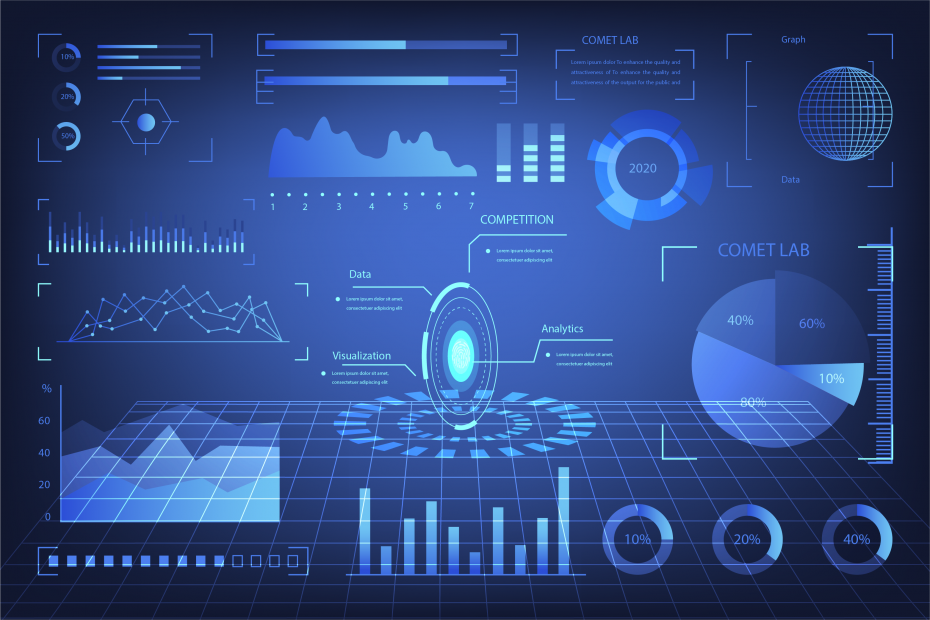
Here’s a detailed explanation of Data Visualization, including key points and descriptions.
What is Data Visualization?
Data Visualization is the graphical representation of information and data. By using visual elements like charts, graphs, and maps, data visualization makes complex data more accessible, understandable, and usable for decision-making.
Key Points:
- Helps in understanding patterns, trends, and outliers in data.
- Improves communication of insights to both technical and non-technical audiences.
- Uses different tools and techniques to represent data effectively.
Importance of Data Visualization
- Better Data Analysis: Helps in identifying trends and correlations quickly.
- Enhanced Decision-Making: Provides clear insights for businesses and researchers.
- Efficient Storytelling: Transforms raw data into a meaningful story.
- Easier Comparisons: Makes comparing data sets more intuitive.
- Data-Driven Strategy: Helps organizations base decisions on real-world data rather than intuition.
Types of Data Visualization
Different types of data require different visual representations:
1. Charts & Graphs:
- Bar Chart: Compares categories using rectangular bars.
- Line Chart: Shows trends over time.
- Pie Chart: Represents proportions as slices of a circle.
- Histogram: Displays frequency distributions.
- Scatter Plot: Shows relationships between two variables.
2. Maps:
- Geographical Maps: Used for location-based data visualization.
- Heat Maps: Uses color intensity to show variations in data.
3. Infographics & Dashboards:
- Infographics: Combines text, visuals, and data in a compelling format.
- Dashboards: Provide an interactive summary of key metrics.
Popular Data Visualization Tools
- Tableau: A powerful tool for interactive dashboards.
- Microsoft Power BI: Integrates with business intelligence solutions.
- Google Data Studio: Free and easy-to-use for reports.
- D3.js: A JavaScript library for creating custom visualizations.
- Python Libraries (Matplotlib, Seaborn, Plotly): Used for coding-based visualization.
Best Practices in Data Visualization
- Choose the Right Chart Type: Use appropriate charts based on the data type.
- Keep it Simple & Clear: Avoid clutter and focus on key insights.
- Use Colors Wisely: Differentiate data without making it too complex.
- Ensure Accuracy: Avoid misleading representations.
- Make it Interactive: Allow users to explore data dynamically.
Conclusion
Data visualization is a crucial tool in today’s data-driven world. Whether in business, research, or daily decision-making, visualizing data enhances understanding and drives better conclusions. Choosing the right tools and following best practices can maximize the effectiveness of data storytelling.
Categories
- Make Money
- Product Review
- Social Media
- Excel
- Graphics design
- Freelancing/Consulting
- E-commerce and Digital Marketing
- Business
- Self Development
- Tips to Success
- Video Editing
- Photo Editing
- Website Promotion
- YouTube
- Computer
- Phone
- Music
- Spirituality & Faith
- School
- Tech & Digital
- Gaming
- News
- Digital Economy / Technology
- Relationship
- Creative Arts & Design
- Medical
- Causes
- Networking
Read More
Entrepreneurship is a journey filled with challenges, risks, and rewards. While some entrepreneurs struggle to find their footing, others build empires that transform industries. What sets the most successful entrepreneurs apart? Let’s uncover the key secrets behind their success and extract valuable lessons from the best. 1. Vision and Passion Lesson: Great entrepreneurs possess a...

Here are key steps to become exceptional and focused in a working environment, with practical examples for each point: 1. Set Clear Goals Key Point: Define what success looks like in your role—short-term and long-term. Example: A sales executive sets a monthly target to increase client retention by 20%. 2. Master Time Management Key Point: Prioritize...

Most people carry the most powerful business tool ever created in their pocket—and use it mainly for entertainment. Your phone is not the problem.How you use it is. The same device used to scroll endlessly is also being used by others to learn skills, build income, run businesses, and create opportunities. The difference isn’t access. It’s intent. The Phone Is...

In any outdoor setting—whether it’s a construction site, a public event, or a traffic rerouting project—safety and visibility are top priorities. One of the most effective tools to achieve this is the use of outdoor colour barricades. These highly visible barriers help prevent accidents, restrict access, and guide pedestrians or vehicles, all while standing up to harsh weather...

Here's a detailed guide on optimizing JavaScript for better web performance, including explanations, keywords, and examples. JavaScript plays a crucial role in modern web applications, but excessive or inefficient JavaScript can lead to slow loading times, unresponsive UI, and poor user experience. Optimizing JavaScript helps improve website speed, responsiveness, and SEO ranking. Below are...