

, Check Verification Solution Hub Groupes Pages Marketplace Evènements Blogs Financement Offres Emplois Courses Film Jeux Merits
 Terms and Conditions
 Legal & Business Law Agreement
 Child Safety & Policy
 App Installation Guide
 User Guide Page
 Investors & Partnership agreement
 About Us
 Flowisetech Earning Guide
 Terms of Use
 Politique de confidentialité
 Help
Help
 FAQs
FAQs
 Community Guidelines
 Our Purpose
 Withdrawal Terms
 Verification Terms
 Community Policy
How to Build a Responsive Navbar with HTML, CSS, & JavaScript
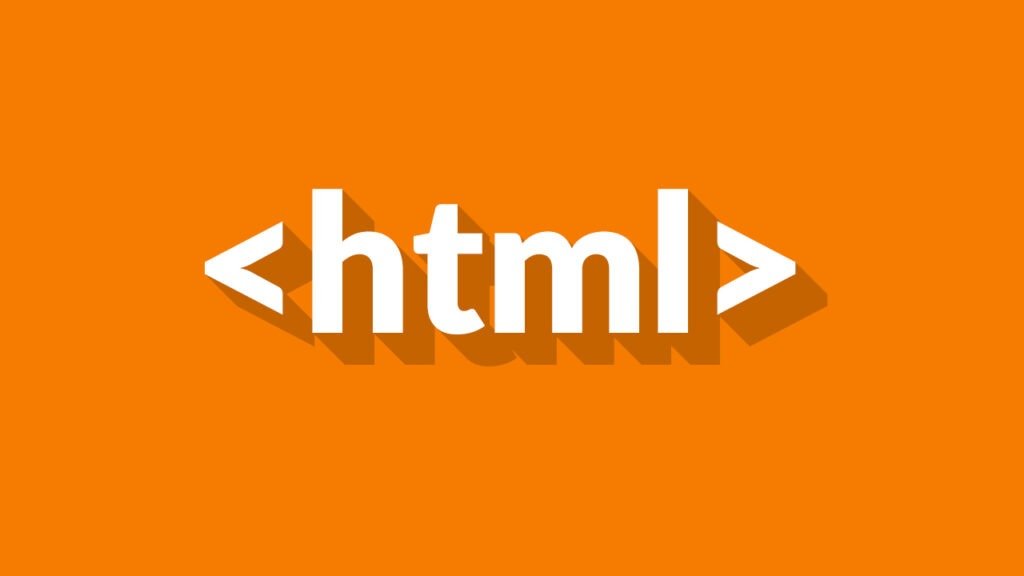
Here’s a detailed guide on How to Build a Responsive Navbar with HTML, CSS, & JavaScript, including explanations, keywords, and examples.
A Responsive Navigation Bar (Navbar) is a crucial component of modern web design. It allows users to navigate through different sections of a website smoothly on different screen sizes (desktop, tablet, and mobile).
Key Features of the Responsive Navbar
- Mobile-Friendly Design - Adjusts layout based on screen size.
- Hamburger Menu (Toggle Button) - Collapses into an icon on small screens.
- Dropdown Submenu - Allows for nested navigation.
- Sticky Navbar - Stays fixed at the top when scrolling.
- Dark Mode Toggle - Allows users to switch between light and dark themes.
- Smooth Animations - Enhances user experience.
- Search Bar Integration - Allows users to search within the site.
Step 1: HTML Structure
We start by writing a clean, semantic HTML structure.
Code: index.html
<!DOCTYPE html>
<html lang="en">
<head>
    <meta charset="UTF-8">
    <meta name="viewport" content="width=device-width, initial-scale=1.0">
    <title>Responsive Navbar</title>
    <link rel="stylesheet" href="styles.css">
    <script defer src="script.js"></script>
</head>
<body>

    <nav class="navbar">
        <div class="logo">MySite</div>
        <ul class="nav-links">
            <li><a href="#">Home</a></li>
            <li><a href="#">About</a></li>
            <li class="dropdown">
                <a href="#">Services ▼</a>
                <ul class="dropdown-menu">
                    <li><a href="#">Web Design</a></li>
                    <li><a href="#">SEO</a></li>
                    <li><a href="#">Marketing</a></li>
                </ul>
            </li>
            <li><a href="#">Contact</a></li>
        </ul>
        <div class="hamburger">
            ☰
        </div>
    </nav>

</body>
</html>
Explanation:
<nav>- The navigation bar wrapper.<div class="logo">- Displays the brand name.<ul class="nav-links">- Holds all navigation items.<li class="dropdown">- Contains a submenu inside an unordered list (<ul class="dropdown-menu">).<div class="hamburger">- A toggle button for mobile screens.
Step 2: Styling with CSS
To make the navbar visually appealing and responsive, we use CSS.
Code: styles.css
/* General Styles */
body {
    margin: 0;
    font-family: Arial, sans-serif;
}

/* Navbar Styling */
.navbar {
    display: flex;
    justify-content: space-between;
    align-items: center;
    background: #333;
    padding: 15px 20px;
    color: white;
}

/* Logo */
.logo {
    font-size: 1.5em;
    font-weight: bold;
}

/* Navigation Links */
.nav-links {
    list-style: none;
    display: flex;
    gap: 20px;
}

.nav-links li {
    position: relative;
}

.nav-links a {
    text-decoration: none;
    color: white;
    padding: 10px;
    transition: 0.3s;
}

.nav-links a:hover {
    background: #555;
    border-radius: 5px;
}

/* Dropdown Menu */
.dropdown-menu {
    display: none;
    position: absolute;
    background: #444;
    list-style: none;
    top: 35px;
    left: 0;
    padding: 10px;
    border-radius: 5px;
}

.dropdown:hover .dropdown-menu {
    display: block;
}

.dropdown-menu li {
    padding: 10px;
}

.dropdown-menu li a {
    color: white;
}

/* Hamburger Icon */
.hamburger {
    font-size: 1.8em;
    display: none;
    cursor: pointer;
}

/* Responsive Design */
@media (max-width: 768px) {
    .nav-links {
        display: none;
        flex-direction: column;
        position: absolute;
        top: 60px;
        right: 0;
        background: #333;
        width: 100%;
        text-align: center;
    }

    .nav-links.active {
        display: flex;
    }

    .hamburger {
        display: block;
    }
}
Explanation:
- Flexbox (
display: flex;) - Used for positioning elements efficiently. - Dropdown (
position: absolute;) - The submenu appears when hovering. - Media Query (
@media (max-width: 768px)) - Adjusts the navbar for mobile screens. - Hamburger Icon (
display: none;) - Initially hidden but shown in mobile view.
Step 3: Adding JavaScript for Interactivity
We use JavaScript to toggle the mobile menu.
Code: script.js
document.addEventListener("DOMContentLoaded", () => {
    const hamburger = document.querySelector(".hamburger");
    const navLinks = document.querySelector(".nav-links");

    hamburger.addEventListener("click", () => {
        navLinks.classList.toggle("active");
    });
});
Explanation:
document.querySelector()- Selects the elements.addEventListener("click", function()")- Triggers the toggle action when clicked.classList.toggle("active")- Adds or removes the class.active, which controls visibility.
Step 4: Enhancements
1. Sticky Navbar
Modify CSS to keep the navbar fixed when scrolling:
.navbar {
    position: fixed;
    width: 100%;
    top: 0;
    z-index: 1000;
}
body {
    padding-top: 60px;
}
2. Dark Mode Toggle
Add a button to switch themes:
<button id="dark-mode-toggle">Dark Mode</button>
Modify JavaScript:
document.getElementById("dark-mode-toggle").addEventListener("click", () => {
    document.body.classList.toggle("dark-mode");
});
Modify CSS:
.dark-mode {
    background: #121212;
    color: white;
}
Final Thoughts
By following this guide, you've built a fully functional responsive navbar that adapts to different devices, supports a dropdown menu, and includes a dark mode toggle. You can further enhance it by adding animations, a search bar, or even integrating it with a backend for dynamic content.
Key Takeaways
- HTML for structure
- CSS for styling & responsiveness
- JavaScript for interactivity
- Flexbox for layout
- Media Queries for responsiveness
Catégories
- Make Money
- Product Review
- Social Media
- Excel
- Graphics design
- Freelancing/Consulting
- E-commerce and Digital Marketing
- Business
- Self Development
- Tips to Success
- Video Editing
- Photo Editing
- Website Promotion
- YouTube
- Computer
- Téléphone
- Music
- Spirituality & Faith
- École
- Tech & Digital
- Gaming
- News
- Digital Economy / Technology
- Relation
- Creative Arts & Design
- Medical
- Causes
- Networking
Lire la suite
In a way, this turn Golden Goose of consumer events makes perfect sense people have a direct line to an audience they know are avid shoppers, always on the hunt. My morning commute is often rushed have to book it a mile and a half from Central to my office across town in so rather than walk, take the subway. designers like his own eponymous label have fast become some of the biggest names on...

Starting a career in Computer Science can be both an exciting and transformative journey. Whether you're a student fresh out of high school, someone switching fields, or just curious about technology, there’s a path for you. Let’s take a narrative walk through the steps you can follow to build a solid foundation and launch your career in computer science. The Beginning:...

Promoting a social media page effectively requires a mix of strategies to grow your audience, engage them, and maintain consistent activity. Here’s a step-by-step guide: 1. Define Your Target Audience Understand who you’re trying to reach (age, interests, location, etc.). Tailor your content to their preferences and needs. 2. Optimize Your Profile Use a clear and...

Python is a powerful, versatile, and beginner-friendly programming language known for its simplicity and readability. Created by Guido van Rossum in 1991, Python has become one of the most popular languages for software development, data analysis, artificial intelligence, web development, automation, and more. Key Features of Python: Simple Syntax: Python’s syntax is clean and easy to...

For many students in Nigeria, making money while studying feels almost impossible. School schedules are tight, jobs are scarce, and capital is limited. I used to think the same—until I discovered that earning ₦100,000 monthly as a student is possible, without quitting school or doing anything illegal. In this post, I’ll break down exactly how I do it, step by step, and how you can...