


, Check Verification Solution Hub Groups Pages Market Events Blogs Funding Offers Jobs Courses Movies Games Merits
 Terms and Conditions
 Legal & Business Law Agreement
 Child Safety & Policy
 App Installation Guide
 User Guide Page
 Investors & Partnership agreement
 About Us
 Flowisetech Earning Guide
 Terms of Use
 Privacy Policy
 Help
Help
 FAQs
FAQs
 Community Guidelines
 Our Purpose
 Withdrawal Terms
 Verification Terms
 Community Policy
Mastering CSS Grid & Flexbox for Modern Layouts
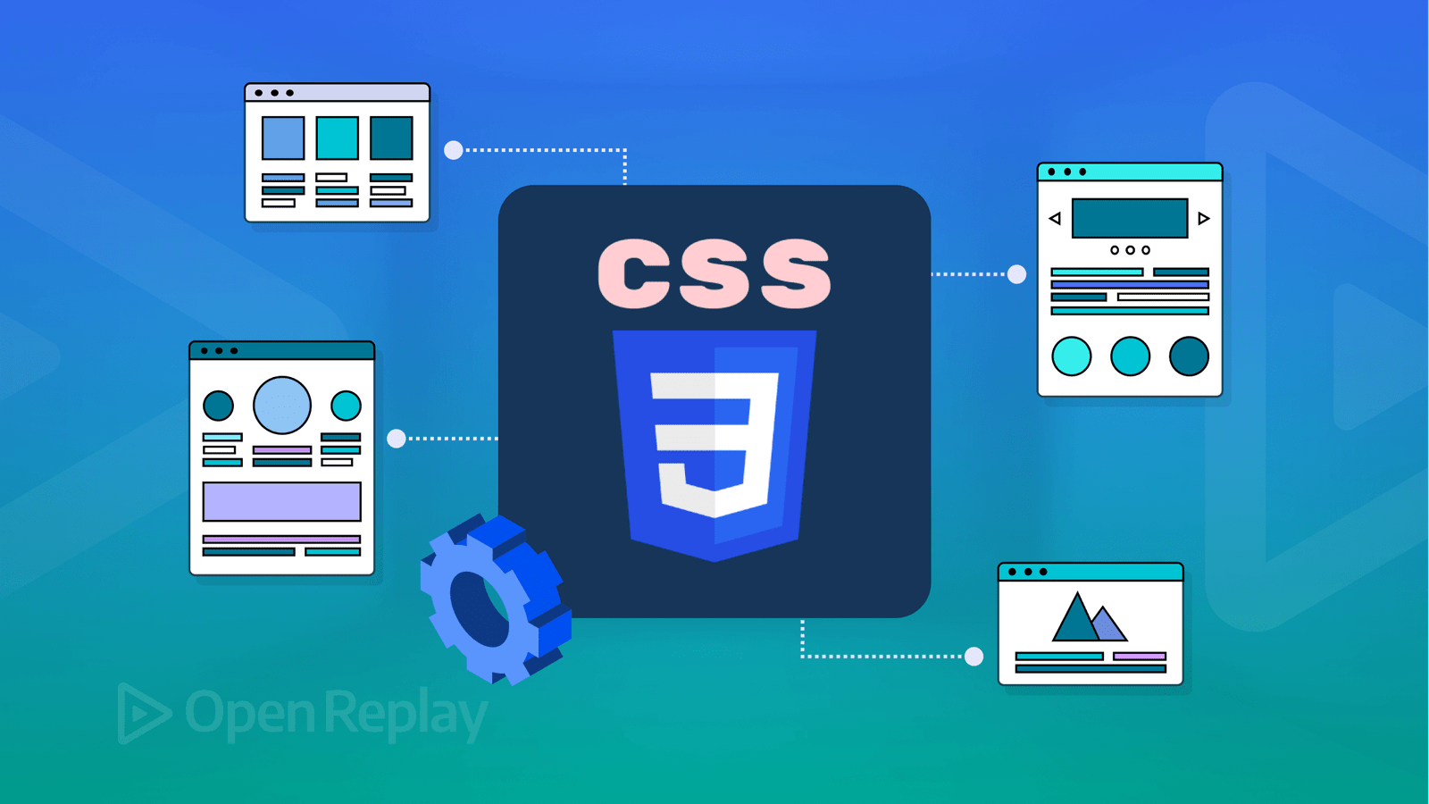
Modern web design relies heavily on CSS Grid and Flexbox to create responsive, adaptable, and visually appealing layouts. While both serve the purpose of arranging elements, they have different use cases and strengths. This guide covers the fundamental concepts, keywords, and practical examples to help you master CSS Grid and Flexbox.
Understanding CSS Flexbox
Flexbox is a one-dimensional layout model, meaning it controls either the row or column layout but not both simultaneously.
Key Concepts & Properties:
-
display: flex – Enables the flexbox model on a container.
-
flex-direction – Defines the direction of flex items (
row,column,row-reverse,column-reverse). -
justify-content – Aligns items along the main axis (
flex-start,flex-end,center,space-between,space-around,space-evenly). -
align-items – Aligns items along the cross axis (
stretch,flex-start,flex-end,center,baseline). -
align-self – Adjusts alignment of individual items.
-
flex-wrap – Allows items to wrap to a new line (
nowrap,wrap,wrap-reverse). -
gap – Adds spacing between flex items.
Example: Basic Flexbox Layout
.container {
  display: flex;
  flex-direction: row;
  justify-content: space-between;
  align-items: center;
}
.item {
  width: 100px;
  height: 100px;
  background-color: steelblue;
  color: white;
  text-align: center;
  line-height: 100px;
}
<div class="container">
<div class="item">1</div>
<div class="item">2</div>
<div class="item">3</div>
</div>Understanding CSS Grid
CSS Grid is a two-dimensional layout system, meaning it can control both rows and columns simultaneously.
Key Concepts & Properties:
-
display: grid – Enables the grid model.
-
grid-template-columns / grid-template-rows – Defines the column and row structure.
-
grid-gap (gap) – Sets the spacing between grid items.
-
grid-column / grid-row – Controls an item's position in the grid.
-
justify-items – Aligns items along the row (
start,center,end,stretch). -
align-items – Aligns items along the column (
start,center,end,stretch). -
grid-template-areas – Defines named sections of the grid.
Example: Basic Grid Layout
.container {
  display: grid;
  grid-template-columns: repeat(3, 1fr);
  gap: 10px;
}
.item {
  background-color: coral;
  color: white;
  padding: 20px;
  text-align: center;
}
<div class="container">
<div class="item">1</div>
<div class="item">2</div>
<div class="item">3</div>
</div>When to Use Flexbox vs. Grid
| Feature | Flexbox | Grid |
|---|---|---|
| Layout type | One-dimensional | Two-dimensional |
| Best for | Navigation bars, single rows or columns | Complex web layouts with rows and columns |
| Alignment | Strong control over alignment | More control over item placement |
| Responsiveness | Easily adjusts for different screen sizes | More structured but flexible |
Example: Combining Flexbox and Grid
.container {
  display: grid;
  grid-template-columns: 1fr 2fr;
  gap: 20px;
}
.sidebar {
  background-color: lightgray;
  padding: 20px;
}
.content {
  display: flex;
  flex-direction: column;
  justify-content: center;
  align-items: center;
  background-color: lightblue;
  padding: 20px;
}
<div class="container">
<div class="sidebar">Sidebar</div>
<div class="content">Main Content</div>
</div>Mastering CSS Grid and Flexbox allows for the creation of flexible, scalable, and responsive layouts. By understanding their properties and knowing when to use each, you can craft modern web designs efficiently.
Categories
- Make Money
- Product Review
- Social Media
- Excel
- Graphics design
- Freelancing/Consulting
- E-commerce and Digital Marketing
- Business
- Self Development
- Tips to Success
- Video Editing
- Photo Editing
- Website Promotion
- YouTube
- Computer
- Phone
- Music
- Spirituality & Faith
- School
- Tech & Digital
- Gaming
- News
- Digital Economy / Technology
- Relationship
- Creative Arts & Design
- Medical
- Causes
- Networking
Read More
Holiday seasons are some of the most profitable times of the year. From Christmas lights to New Year decor, people are always willing to spend money to make their homes, offices, and events look special. What many don’t realize is that this demand creates a powerful opportunity: you can turn holiday decorations into a real business. Whether you’re creative, enjoy crafting, or...

For decades, we were taught a simple formula for success: work hard, stay disciplined, and everything will fall into place. That advice built nations, companies, and careers. But in today’s world—especially for young people—that formula is no longer complete. Hard work still matters. But hard work alone is no longer enough. Here’s why—and what actually works now....

Databases are crucial in modern applications, playing several key roles: Data Storage: Databases provide a structured way to store and manage data. This is essential for applications that need to handle large volumes of information, from user profiles to transactional records. Data Retrieval: Efficient querying capabilities allow applications to retrieve specific pieces of data...

Life is a journey filled with experiences, challenges, and moments of joy. In the pursuit of success, many often overlook the essential elements that sustain us: mental and physical well-being. A balanced life is one where both mind and body are nurtured, allowing us to thrive rather than merely survive. The interplay between mental and physical health is undeniable, and achieving harmony...
The festive season is a golden opportunity for aspiring entrepreneurs to make money while spreading joy. With increased spending on gifts, food, clothing, and celebrations, smart business owners can tap into this period to generate impressive profits — even with limited capital. If you’re looking for profitable festive season business ideas that require low investment but high...