


Refer and earn for every successful referral. Also, the most active user wins ₦5,000 in cash!
, Check Verification Solution Hub Groupes Pages Marketplace Evènements Blogs Financement Offres Emplois Courses Film Jeux Merits
 Terms and Conditions
 Legal & Business Law Agreement
 Child Safety & Policy
 App Installation Guide
 User Guide Page
 Investors & Partnership agreement
 About Us
 Flowisetech Earning Guide
 Terms of Use
 Politique de confidentialité
 Help
Help
 FAQs
FAQs
 Community Guidelines
 Our Purpose
 Withdrawal Terms
 Verification Terms
 Community Policy
Mastering CSS Grid & Flexbox for Modern Layouts
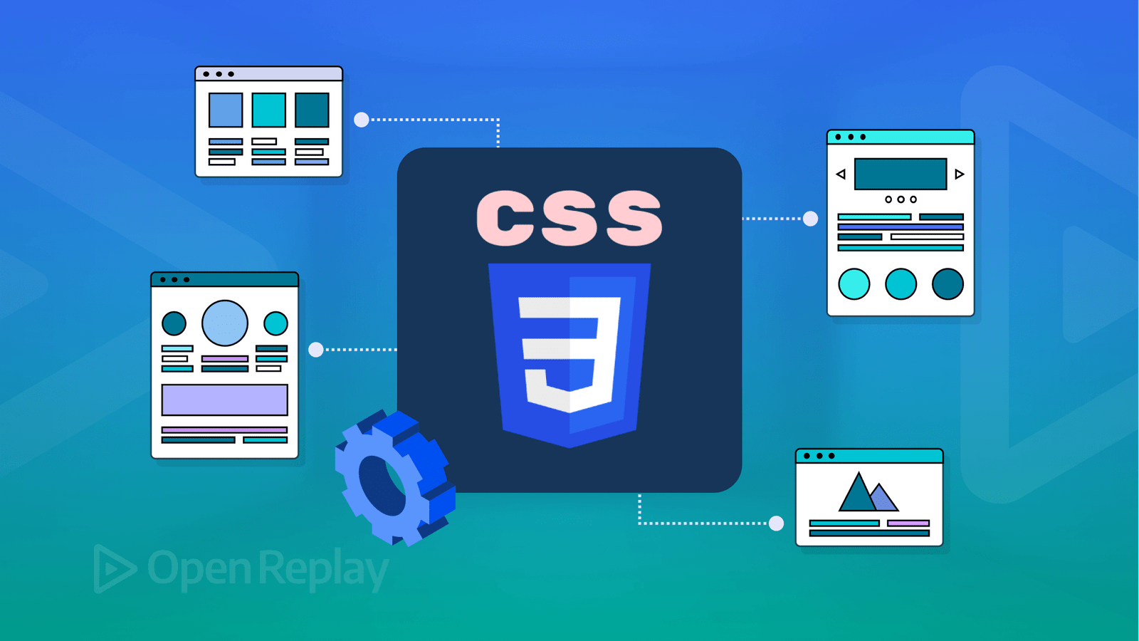
Modern web design relies heavily on CSS Grid and Flexbox to create responsive, adaptable, and visually appealing layouts. While both serve the purpose of arranging elements, they have different use cases and strengths. This guide covers the fundamental concepts, keywords, and practical examples to help you master CSS Grid and Flexbox.
Understanding CSS Flexbox
Flexbox is a one-dimensional layout model, meaning it controls either the row or column layout but not both simultaneously.
Key Concepts & Properties:
-
display: flex – Enables the flexbox model on a container.
-
flex-direction – Defines the direction of flex items (
row,column,row-reverse,column-reverse). -
justify-content – Aligns items along the main axis (
flex-start,flex-end,center,space-between,space-around,space-evenly). -
align-items – Aligns items along the cross axis (
stretch,flex-start,flex-end,center,baseline). -
align-self – Adjusts alignment of individual items.
-
flex-wrap – Allows items to wrap to a new line (
nowrap,wrap,wrap-reverse). -
gap – Adds spacing between flex items.
Example: Basic Flexbox Layout
.container {
  display: flex;
  flex-direction: row;
  justify-content: space-between;
  align-items: center;
}
.item {
  width: 100px;
  height: 100px;
  background-color: steelblue;
  color: white;
  text-align: center;
  line-height: 100px;
}
<div class="container">
<div class="item">1</div>
<div class="item">2</div>
<div class="item">3</div>
</div>Understanding CSS Grid
CSS Grid is a two-dimensional layout system, meaning it can control both rows and columns simultaneously.
Key Concepts & Properties:
-
display: grid – Enables the grid model.
-
grid-template-columns / grid-template-rows – Defines the column and row structure.
-
grid-gap (gap) – Sets the spacing between grid items.
-
grid-column / grid-row – Controls an item's position in the grid.
-
justify-items – Aligns items along the row (
start,center,end,stretch). -
align-items – Aligns items along the column (
start,center,end,stretch). -
grid-template-areas – Defines named sections of the grid.
Example: Basic Grid Layout
.container {
  display: grid;
  grid-template-columns: repeat(3, 1fr);
  gap: 10px;
}
.item {
  background-color: coral;
  color: white;
  padding: 20px;
  text-align: center;
}
<div class="container">
<div class="item">1</div>
<div class="item">2</div>
<div class="item">3</div>
</div>When to Use Flexbox vs. Grid
| Feature | Flexbox | Grid |
|---|---|---|
| Layout type | One-dimensional | Two-dimensional |
| Best for | Navigation bars, single rows or columns | Complex web layouts with rows and columns |
| Alignment | Strong control over alignment | More control over item placement |
| Responsiveness | Easily adjusts for different screen sizes | More structured but flexible |
Example: Combining Flexbox and Grid
.container {
  display: grid;
  grid-template-columns: 1fr 2fr;
  gap: 20px;
}
.sidebar {
  background-color: lightgray;
  padding: 20px;
}
.content {
  display: flex;
  flex-direction: column;
  justify-content: center;
  align-items: center;
  background-color: lightblue;
  padding: 20px;
}
<div class="container">
<div class="sidebar">Sidebar</div>
<div class="content">Main Content</div>
</div>Mastering CSS Grid and Flexbox allows for the creation of flexible, scalable, and responsive layouts. By understanding their properties and knowing when to use each, you can craft modern web designs efficiently.
Catégories
- Make Money
- Product Review
- Social Media
- Excel
- Graphics design
- Freelancing/Consulting
- E-commerce and Digital Marketing
- Business
- Self Development
- Tips to Success
- Video Editing
- Photo Editing
- Website Promotion
- YouTube
- Computer
- Téléphone
- Music
- Spirituality & Faith
- École
- Tech & Digital
- Gaming
- News
- Digital Economy / Technology
- Relation
- Creative Arts & Design
- Medical
- Causes
- Networking
Lire la suite
Building a reliable income stream no longer requires large startup funds. Thanks to digital platforms, remote work, and the growing knowledge economy, there are multiple low-risk, low-cost opportunities that allow you to earn, grow, and scale with minimal financial investment. What matters most today is skill, consistency, and strategy—not capital. Below are some of the top income...

A silent shift is happening in the global economy. It’s not loud. It’s not always obvious. But it’s powerful.Digital assets are slowly replacing traditional career paths, and many people won’t realize it until the gap is impossible to ignore. This isn’t about jobs disappearing overnight. It’s about how value, income, and security are being redefined. What...

The tech industry is one of the few fields where skills matter more than degrees. Many successful developers, designers, and tech entrepreneurs started their careers without a university diploma. Whether you couldn’t attend university or simply prefer a different path, this guide will show you how to start a tech career without a degree, step by step. 1. Identify Your Tech...

Making money from WhatsApp can be highly profitable if done strategically. Since WhatsApp doesn’t allow direct monetization like YouTube or blogging, you have to use creative ways to leverage the platform for business. Below are several effective methods, along with step-by-step instructions on how to execute them. 1. Affiliate Marketing on WhatsApp Affiliate marketing involves...

Here’s a detailed guide on Business Ideas, covering various profitable opportunities, key considerations, and how to get started. Starting a business is an exciting journey that requires careful planning, creativity, and determination. Below are some lucrative business ideas categorized into different industries, along with step-by-step guides on how to start them. 1. Online Business...