


, Check Verification Solution Hub Groupes Pages Marketplace Evènements Blogs Financement Offres Emplois Courses Film Jeux Merits
 Terms and Conditions
 Legal & Business Law Agreement
 Child Safety & Policy
 App Installation Guide
 User Guide Page
 Investors & Partnership agreement
 About Us
 Flowisetech Earning Guide
 Terms of Use
 Politique de confidentialité
 Help
Help
 FAQs
FAQs
 Community Guidelines
 Our Purpose
 Withdrawal Terms
 Verification Terms
 Community Policy
Mastering CSS Grid & Flexbox for Modern Layouts
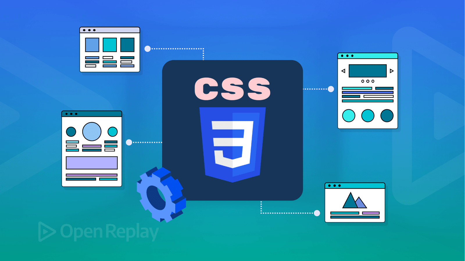
Modern web design relies heavily on CSS Grid and Flexbox to create responsive, adaptable, and visually appealing layouts. While both serve the purpose of arranging elements, they have different use cases and strengths. This guide covers the fundamental concepts, keywords, and practical examples to help you master CSS Grid and Flexbox.
Understanding CSS Flexbox
Flexbox is a one-dimensional layout model, meaning it controls either the row or column layout but not both simultaneously.
Key Concepts & Properties:
-
display: flex – Enables the flexbox model on a container.
-
flex-direction – Defines the direction of flex items (
row,column,row-reverse,column-reverse). -
justify-content – Aligns items along the main axis (
flex-start,flex-end,center,space-between,space-around,space-evenly). -
align-items – Aligns items along the cross axis (
stretch,flex-start,flex-end,center,baseline). -
align-self – Adjusts alignment of individual items.
-
flex-wrap – Allows items to wrap to a new line (
nowrap,wrap,wrap-reverse). -
gap – Adds spacing between flex items.
Example: Basic Flexbox Layout
.container {
  display: flex;
  flex-direction: row;
  justify-content: space-between;
  align-items: center;
}
.item {
  width: 100px;
  height: 100px;
  background-color: steelblue;
  color: white;
  text-align: center;
  line-height: 100px;
}
<div class="container">
<div class="item">1</div>
<div class="item">2</div>
<div class="item">3</div>
</div>Understanding CSS Grid
CSS Grid is a two-dimensional layout system, meaning it can control both rows and columns simultaneously.
Key Concepts & Properties:
-
display: grid – Enables the grid model.
-
grid-template-columns / grid-template-rows – Defines the column and row structure.
-
grid-gap (gap) – Sets the spacing between grid items.
-
grid-column / grid-row – Controls an item's position in the grid.
-
justify-items – Aligns items along the row (
start,center,end,stretch). -
align-items – Aligns items along the column (
start,center,end,stretch). -
grid-template-areas – Defines named sections of the grid.
Example: Basic Grid Layout
.container {
  display: grid;
  grid-template-columns: repeat(3, 1fr);
  gap: 10px;
}
.item {
  background-color: coral;
  color: white;
  padding: 20px;
  text-align: center;
}
<div class="container">
<div class="item">1</div>
<div class="item">2</div>
<div class="item">3</div>
</div>When to Use Flexbox vs. Grid
| Feature | Flexbox | Grid |
|---|---|---|
| Layout type | One-dimensional | Two-dimensional |
| Best for | Navigation bars, single rows or columns | Complex web layouts with rows and columns |
| Alignment | Strong control over alignment | More control over item placement |
| Responsiveness | Easily adjusts for different screen sizes | More structured but flexible |
Example: Combining Flexbox and Grid
.container {
  display: grid;
  grid-template-columns: 1fr 2fr;
  gap: 20px;
}
.sidebar {
  background-color: lightgray;
  padding: 20px;
}
.content {
  display: flex;
  flex-direction: column;
  justify-content: center;
  align-items: center;
  background-color: lightblue;
  padding: 20px;
}
<div class="container">
<div class="sidebar">Sidebar</div>
<div class="content">Main Content</div>
</div>Mastering CSS Grid and Flexbox allows for the creation of flexible, scalable, and responsive layouts. By understanding their properties and knowing when to use each, you can craft modern web designs efficiently.
Catégories
- Make Money
- Product Review
- Social Media
- Excel
- Graphics design
- Freelancing/Consulting
- E-commerce and Digital Marketing
- Business
- Self Development
- Tips to Success
- Video Editing
- Photo Editing
- Website Promotion
- YouTube
- Computer
- Téléphone
- Music
- Spirituality & Faith
- École
- Tech & Digital
- Gaming
- News
- Digital Economy / Technology
- Relation
- Creative Arts & Design
- Medical
- Causes
- Networking
Lire la suite
Creating a custom WordPress blog theme requires structuring your files properly and coding them using PHP, HTML, CSS, and JavaScript. Below is a step-by-step guide covering all aspects, including file structure, descriptions, and explanations. 1. WordPress Theme File Structure A WordPress theme consists of multiple files, primarily stored in the wp-content/themes/your-theme-name/ directory....

Starting a business without a physical shop is more feasible than ever, thanks to the internet and digital platforms. Below is a detailed guide on how to start a business with no physical shop, covering every essential step. Step 1: Identify Your Business Idea Before anything else, you need a viable business idea that can operate without a physical storefront. Here are some common types of...

Why Digital Tools Matter in Habit-Building Good habits are the foundation of personal growth, productivity, and overall well-being. But sticking to them is often the hardest part. This is where digital tools step in. From habit-tracking apps to AI-driven reminders, technology can keep you consistent, motivated, and accountable as you work toward self-improvement. Key Digital Tools That Help...

BforeAI's PreCrime™ is a pioneering cybersecurity platform that utilizes predictive artificial intelligence to identify and neutralize cyber threats before they materialize. Key aspects of PreCrime™ include: Predictive Analytics: The platform autonomously forecasts and blocks malicious campaigns, such as phishing, spoofing, and ransomware, before they affect businesses. It...

Instagram has evolved into a powerful platform where individuals and businesses can generate income through various strategies. Whether you are an influencer, entrepreneur, or content creator, you can monetize your presence on Instagram by leveraging its vast audience. Step 1: Choose Your Niche To succeed on Instagram, you must pick a niche that aligns with your interests, expertise, and...